Details Behind My 2026 Paint Guide
Choosing paint can feel simple, until you’re standing in a paint store surrounded by hundreds of swatches. Paint is one of the most powerful design tools we have, but it’s also one of the easiest to get wrong. That’s exactly why I make my paint guides, to take the guesswork out of paint selection and replace it with clarity and confidence.
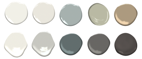
This package includes my hand-selected paint colours for 2026, the ones I’m reaching for again and again in client homes. They’re timeless, easy to live with and most importantly they work in real spaces with real lighting.
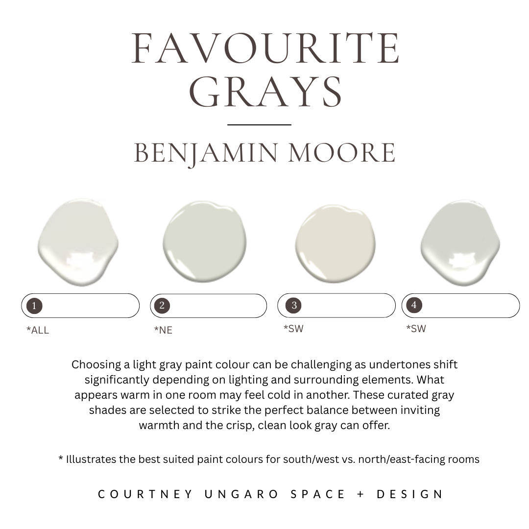
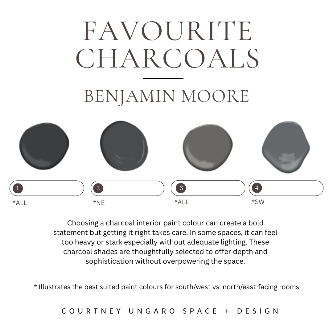
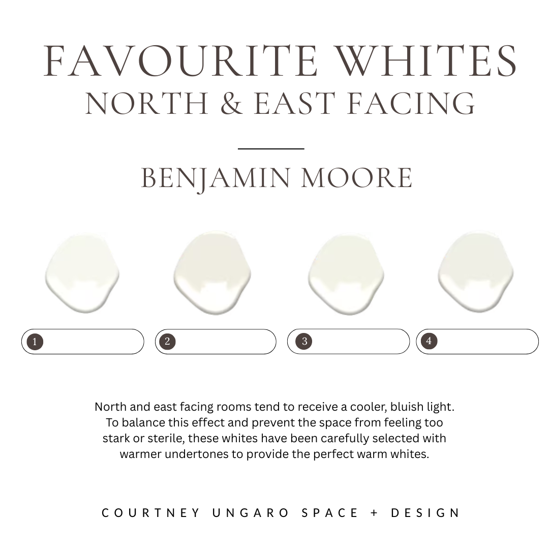
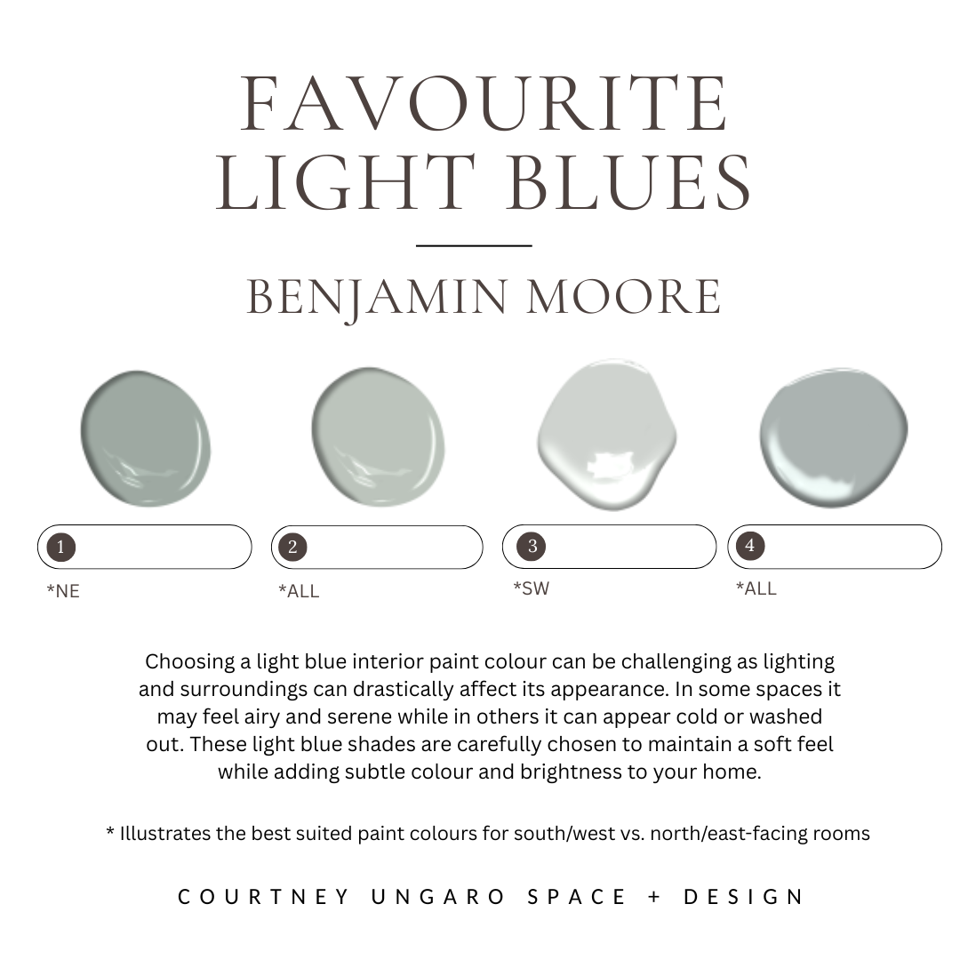
Besides the colours, one of the most important aspects of this guide is its focus on light orientation. North- and east-facing rooms receive cooler, softer light that can make colours feel muted or gray, while south- and west-facing rooms are flooded with warm, golden light that intensifies colour. I break down how light direction affects paint and recommend specific colours that balance these conditions.
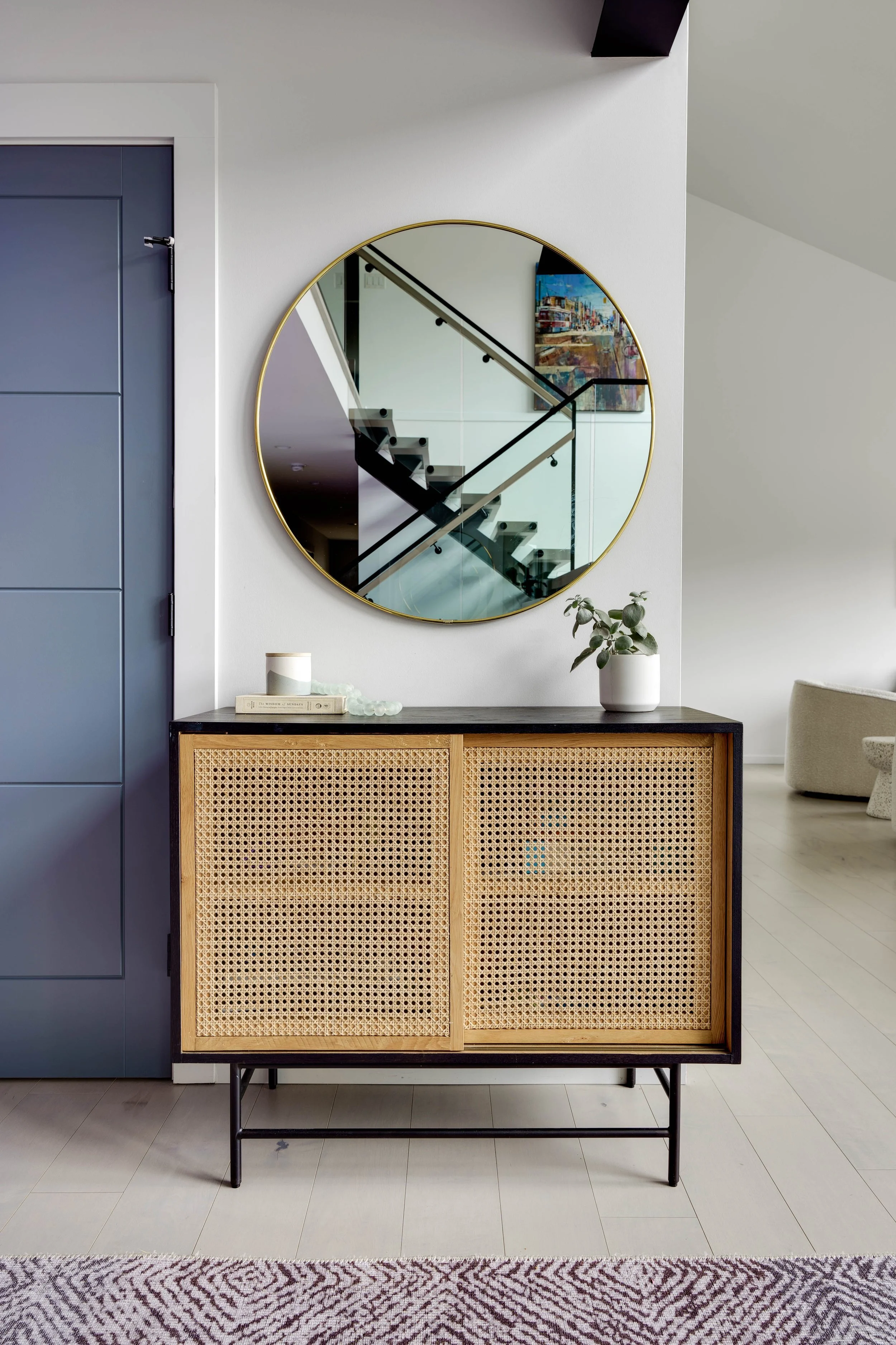
I also keep things simple when it comes to walls, trim and doors. My go-to approach is using the same colour throughout and changing the finish. It creates a clean and elevated look without overcomplicating the process.
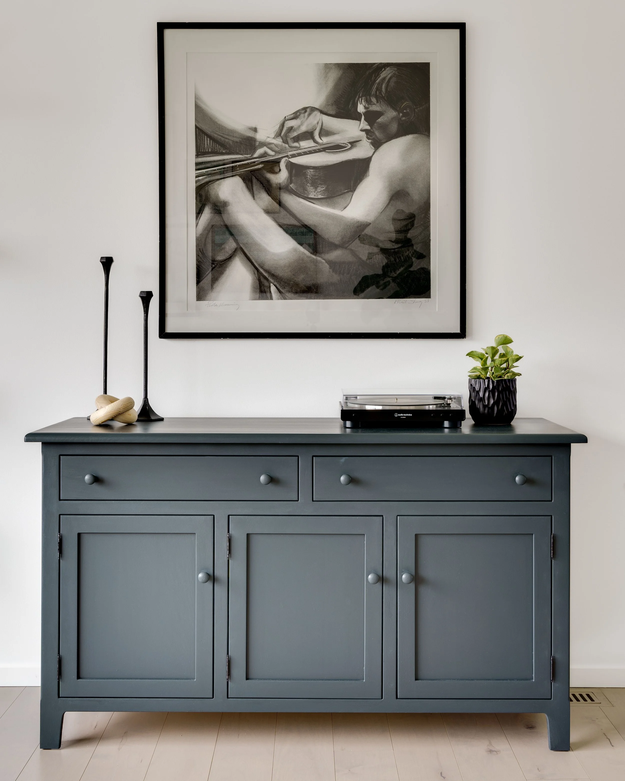
You’ll also find a curated selection of accent colours if you want to add a little depth or personality, whether that’s on cabinetry, built-ins, doors or a feature wall. These are colours that feel intentional and timeless, not just trendy.
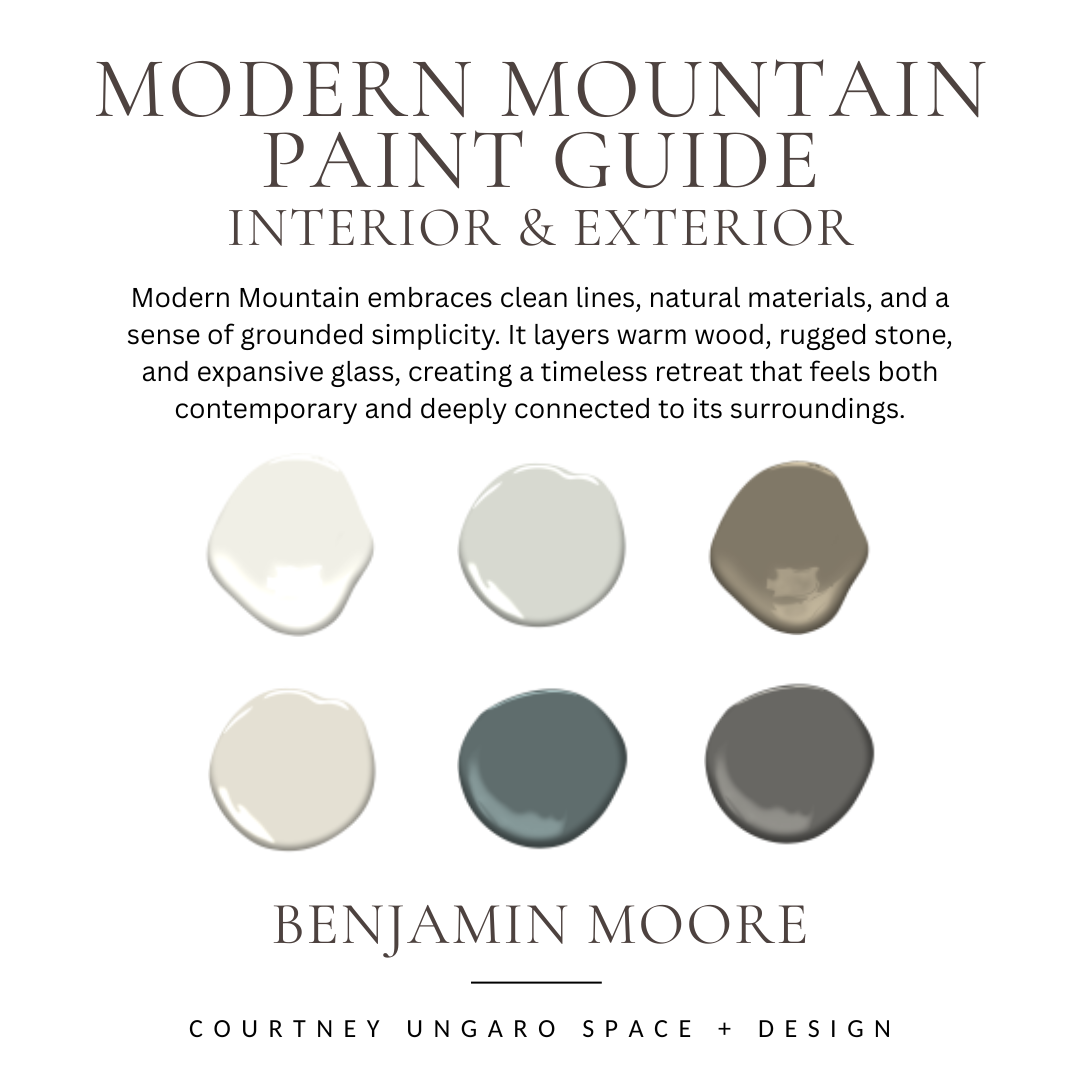
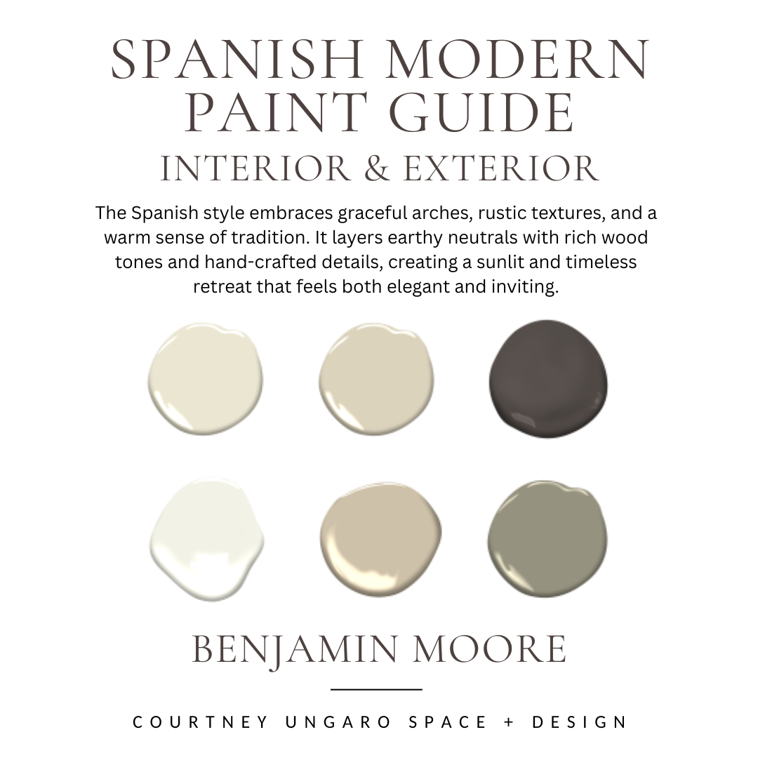
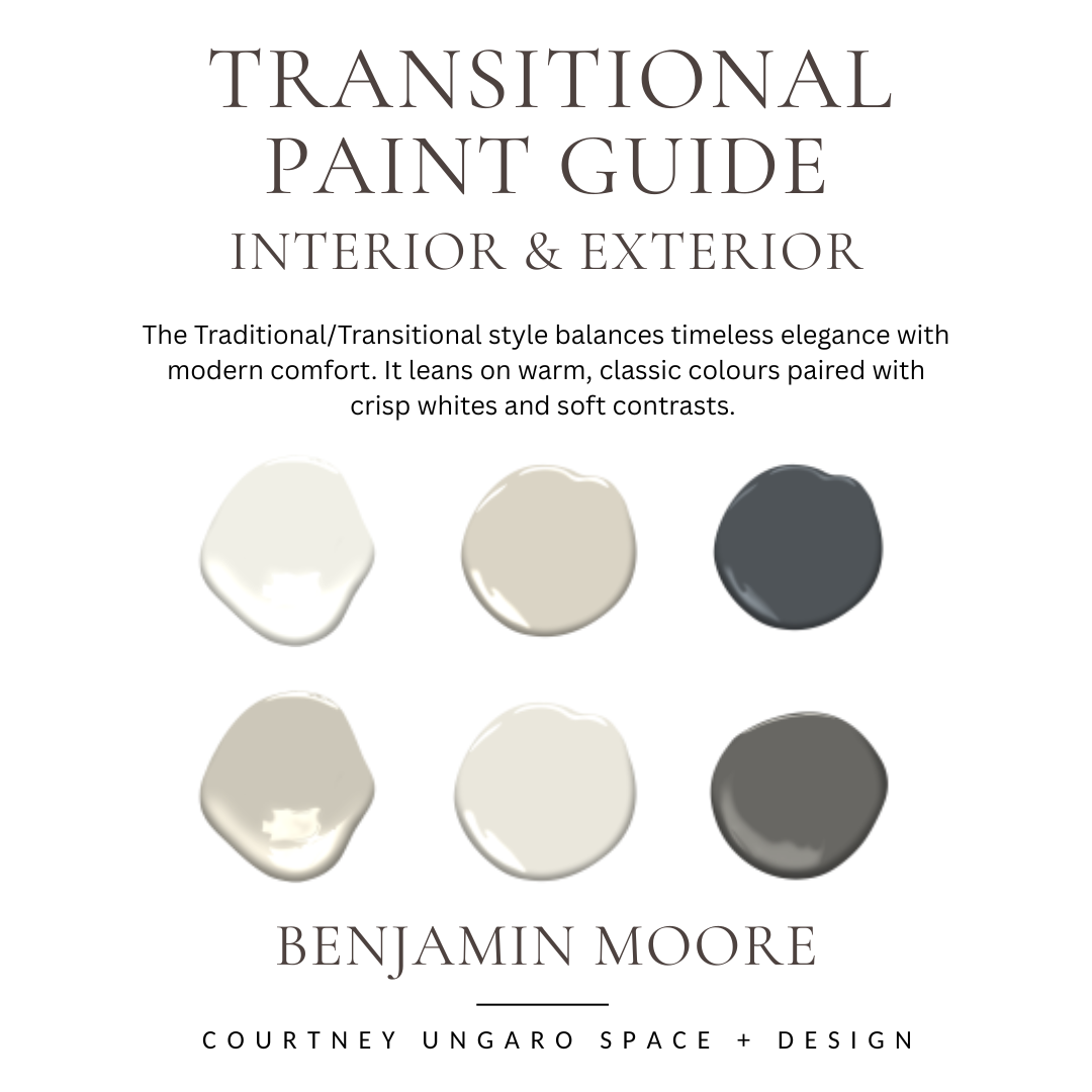
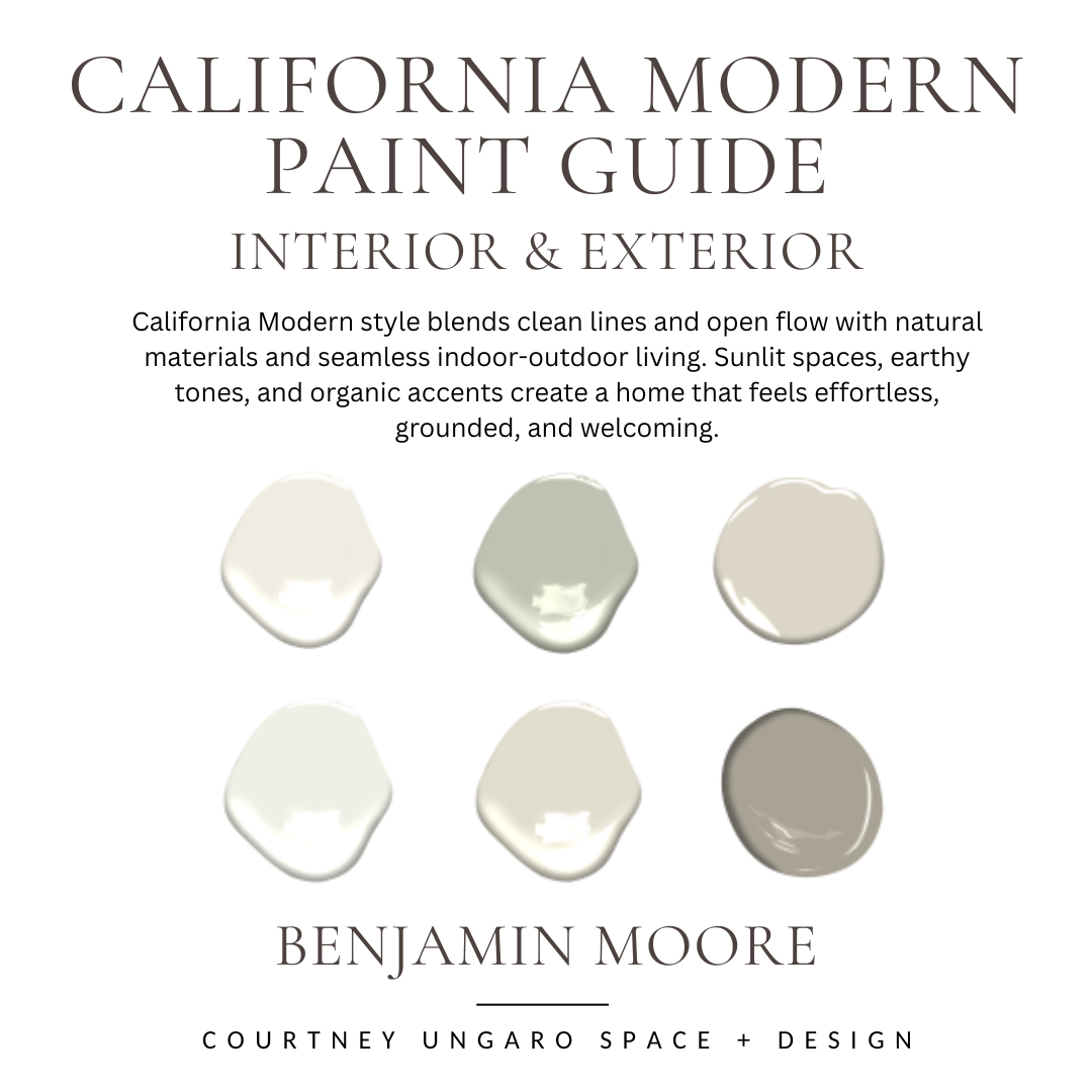
Think of this guide as my 2026 paint edit, but if you’re looking for something more specific you can also explore my house-styled paint guides or colour-specific paint guides down below or click here. Those are perfect if you already know the look you’re drawn to and want a palette that fits that style or tone.
At the end of the day this guide is here to make your paint decisions easier, more confident and a lot less overwhelming. Hope you enjoy it!
- Courtney